This go round, it's all about fixing up my bookcase so it isn't only functional, but lookin good. What I have right now isn't totally awful, but there's none of that "I could just stare at this all day" factor that I adore so much. It's a black Ikea bookcase with 8 squarish compartments and I've simply stuffed all my books and movies into it without paying any attention to how it looks. I did set some heirloom Chinese figurines in front of some of the books, but only because they accidentally got left out of the "Too Good to Goodwill, but I Live in A Tiny Studio and There's Not Enough Room to Display" box in the closet.
On top of the bookcase I've set piles of mail I have yet to go through (ugh that should've been one of my New Year's Resolutions), my headphones and speakers that aren't plugged in, a pinwheel folk art thing my mom gave me, and an "Amberley Whiskey" (yes it's spelled wrong) metal sign hanging above it on the wall. Blah. It's been like that for 3 months and I'm totally over it.
For some inspiration, I collected a few examples of bookcases and bookshelves that I admire:
The cream colors are pretty and I love the picture frames attached in the front. Very unique.
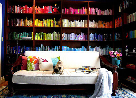
This is rainbow effect is very similar to what I did with all of my books at my old apartment, and I really loved it at the time.
I did a double take when I saw this because for some reason I feel like this is just SO me, as if I put it together in a dream or past life or something. Sorta creepy but awesome.
This look I love, not because of the case but because of the colors and the randomness of everything. It also looks really fresh. We're getting closer to what I want....
Too bad my bookcase is black because this is my FAVORITE look and the same effect just wouldn't be achieved if I tried to copy. But I will take with me: it's not too organized, there is a color theme in place, and there are photos and art that grab your attention.
I also really like this idea for the top of my bookcase. Simplicity, Simplicty, Simplicity!
And if I had crazy amounts of time to waste
(Can you imagine paper covering all of your books by hand? It does look good though, I have to admit. Very Anthropologie.)
Anyway, there are several things I'm noticing about these eye-catching bookshelves:
1. Purposeful color - grouped into colors, pops of bright color, color themes/families
2. Mixed stacking - horizontal and vertical
3. Other objects mixed in with the books - busts, photos, art, knick knacks
Now let the brainstorming begin... (to be continued in a future post)
...And just because this kind of book display is somewhat on trend for reasons I don't know:
I can barely look at it...I'm starting to feel suffocated! I'm guessing this is one of the ways it all begins for the people featured on that A&E show we all secretly love.
all photos via Pinterest


No comments:
Post a Comment
I love the sharing of ideas and getting to know you, so thank you for your comment! It really makes my day!